Social media were once very good at sharing reliable first-hand information about fires, floods, etc. Not any more. Here’s an alternative.

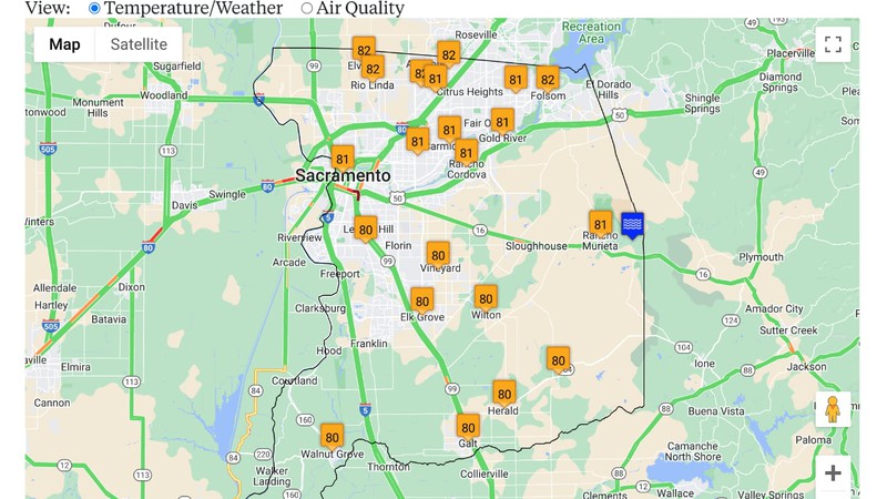
Detail of interactive map that delivers real-time information drawn from reliable sources.
Ground Truth
One of the things social media used to be good for was the sharing of ground truth at scale. By following Twitter’s “What is happening?” prompt, for instance, a dispersed multitude provided direct access to first-hand information globally.
During times of crisis and peril, such as the last few years of fire season and more recently the series of atmospheric rivers that flooded California and the earthquakes in Humboldt County, people used social media to keep track of current conditions. Newsrooms like ours, as well as plugged-in civilians, monitored police and fire scanners and used social media to share vital information about river flood levels, evacuation orders and road closures.
The Social Network Implodes
But that was so last year.
In a breathtakingly short time, mere months, the ability to use social media to find out what’s happening has been wrecked. Under new ownership, Twitter ceased support of its application programming interface (API), which many public agencies used to broadcast weather updates, reports of recent earthquakes, the status of nearby fires, and other vital information. Over the same short span of time, responding to legislation in Australia and Canada and in anticipation of regulation in the US, Facebook/Meta began blocking or deprecating the posting of links to news—to disastrous effect as people in Canada were trying to use Meta platforms to share information about the wildfires sweeping the Northwest Territory and British Columbia.
It’s clear that the social network has decided it doesn’t want to be an information network.
What Now? CALocal Maps.
As late fire season approaches, followed possibly by another extreme winter, we’ve been considering how California Local can best replicate the ability to gather and process information about what’s happening on the ground right now, and provide an accurate and up to date report of current situations.
We already publish a Google Map which incorporates the built-in Traffic layer, visually displaying road closures and areas of traffic congestion. This is overlaid with markers indicating California Highway Patrol (CHP) incidents and California Department of Transportation (CalTrans) construction and closure spots, in addition to chain control and other road condition information.
California state agencies are pretty good at collecting and distributing information in open-data formats over the Internet. CHP publishes their dispatches in an updated list which we import to our database every few minutes for display on our traffic map. CalTrans maintains a network of remote web cameras and sensors that monitor its statewide road system, and distributes this vast amount of real-time information over the Internet. We import all of this and display it on the map pages in each of the nine counties where we currently operate.
Maps are a great way to present an at-a-glance view of a situation that includes a location component, such as traffic. The Google Maps platform makes it simple to incorporate third party information into a map.
Like road traffic, weather has a location component. Here in California, our view of weather is broadened beyond the narrow confines of “rain or shine” and “hot or cold” to include wildfires, floods, snowmageddons and earthquakes. In all cases, they occur in a place, so it became clear to me that a map would be a good way to provide a view of current situations.
Among all federal agencies, the National Oceanic and Atmospheric Administration (NOAA) and the United States Geological Survey (USGS) stand out for the amount of open-data information they produce and publish over the Internet.
Our new weather map again utilizes a Google Map with the built-in Traffic Layer, and imports the recently released Google Air Quality API, as well as current conditions from OpenWeatherMap, which processes NOAA information, to provide a basic map of local temperature/pressure/humidity/AQI.
Clickable markers for active wildfires are overlaid on the map based on open data published on the Internet by the California Department of Forestry and Fire Protection (CalFire) and imported into our database on a regular basis.
AlertCalifornia.org, a network of remote cameras monitoring forests and wildlands for signs of fire, which is managed by the University of California, San Diego, allows public access of near-real time images. We import a list published by the California Office of Emergency Services on an obscure open-data server on the Internet into our database to add clickable markers to the weather map—making it easy to get a mountaintop view of the situation.
NOAA and USGS maintain a network of stream gauges that measure the level of rivers and creeks. Telemetry from these gauges is published on the Internet, and is imported every 20 minutes into our database. Again, that information is displayed with clickable markers overlaid on the weather map.
All of the markers on the map visually indicate conditions, turning from mellow to intense colors as the situation dictates. Clicking on a marker opens a window with more information.
As winter approaches, we’ll be adding more information to the weather map, such as lightning strikes, wind speed and direction and NOAA satellite rain radar overlays using open-data sources.
As California Local’s product director, one of the things I like about the traffic map and the new weather map, is that once the backend code is set up to import the open data, and the map is configured to display it, things just work automatically in the background.
While it’s a shame Big Social has turned away from being useful during times of crisis, it’s helpful that there are enough sensors and cameras out in the field, managed by agencies with a commitment to open data, to make it possible to build an alternative and get the ground truth out.
View Our Maps